Friday, 30 October 2009

Projects 4 & 5


The brief for this project was to capture movement using both a slow shutter speed and the technique of panning. Although I am aware of, and understand, both techniques, I have used neither in practice, so this was a good opportunity to see if it was as easy as it looks. The only motion blur I have captured in my experience so far is the light trail effect at night.

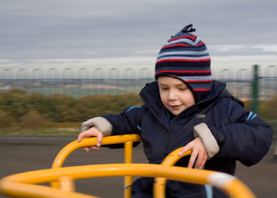
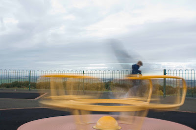
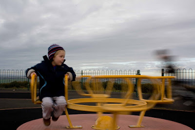
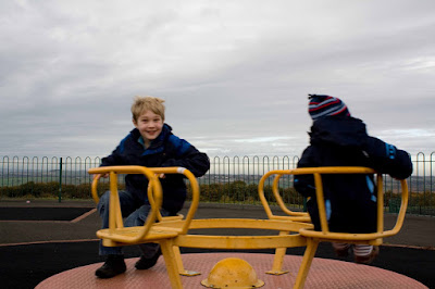
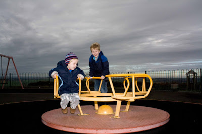
The images shown above are panning at 1/30 second, blur at 1/s, blur at 1/8s, slight motion blur at 1/30s, and freezing motion at 1/125s.

Most photos I have seen with these techniques tend to be either bikes or cars. I decided to try with a children's roundabout in a park, using my 2 young sons as subjects. The particular park in question is situated at the top of a hill, and the view is quite spectacular, so the sky would be the requisite plain and simple background as per the brief. In hindsight, this probably wasn't the easiest subject for a first try, as it meant I had to try and spin the roundabout and then photograph it straight away. As it slows down pretty quickly, I didn't have many opportunities to practice. Also the old adage of never working with children or animals held true, as they quickly became bored and wandered off. However I think I achieved the required results. These are techniques I want to carry on practising, with trains, cars etc. so I will come back and update this post throughout the course.

The roundabout was fairly slow moving, so I was able to freeze motion at 1/125 seconds and even at 1/60 second. I would imagine that 1/60 shutter speed would demonstrate motion blur for a bike/car. At 1/30 second there was a hint of blur but unfortunately this image fell into neither camp of being sharp or displaying motion, so these were the weakest images. Once down to 1/8 second, the motion blur was very attractively displayed, whilst still maintaining some form so you could identify the subject. Another child cycled past and was captured as a blur i.e. he was moving a lot faster than the roundabout. Finally at 1 second exposure time the outline of my son on the roundabout was no longer visible, and the image was quite abstract.

I found panning much harder than it looks, but this was probably down to the subject I had chosen. However I managed to capture 2 images with the panning effect of the slightly streaked background whilst my son was sharp. One was at 1/30 second and the other at 1/15 second.

Overall I managed to obtain one image which was a favourite. This showed motion blur at 1/8 second but I could still clearly identify my son on the roundabout. I also obtained a lot of images which were a bit of a mess and had to be deleted. I intend to use my favourite image in my first assignment as I found it very interesting in it's own right with the colours and of course the dramatic sky. With regards to panning, this is something I will practice with more appropriate subjects, such as trains and bicycles.

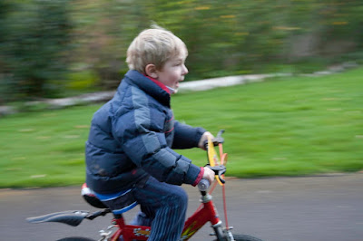
Update as of 1 May 2010 - I finally got round to trying a panning shot with my son on his bike. As I am not really interested in cars, then I guess bikes are the one time when I may use the panning technique. As you can see, the results are not marvelous however they are getting there. The one thing that did strike me was that I should have positioned myself on the other side of the road so that they were travelling from left to right, as the other way feels uncomfortable to my eye. I guess it's an ingrained thing from learning to read left to right, but also reflects the way that we look at things anyway (apparently left to right). Anyway, the benefit of photoshop is that you can just flip them over and there you go - a more comfortable image, apart from the lack of sharpness of the main subjects that is! This image was taken at 1/30 second.
Sunday, 25 October 2009

Project 3


This project aimed to demonstrate depth of field achieved with different apertures. Although I have done this type of experiment several times before, I always enjoy seeing the effects. As my DSLR is likely to go off for repair for a few weeks, this was my last opportunity to try this project.

My chosen subject for this project was Anthon Berg liqueur chocolates, lined up on my kitchen hob. Bottles are often suggested as suitable subjects, however I wanted to give this a bit of a twist. The labelling on the "bottles" are good demonstrators of sharpness of focus, which I would still have with the chocolates. I also wanted to add interest with bright colours and reflections. As these chocolates are small, I chose my Tamron 90mm macro lens. Macro photography naturally has a narrow depth of field, so I wanted to push this to the limits.

I have uploaded 4 photos ranging from f2.8 to f32. As a macro lens was used, even the image at f32 doesn't have full sharpness throughout the image. I chose to focus near to the end of the row at the top right, so the extremes of blurring could be seen at the start of the row on the bottom left. The images are shown in increasing f-stop.

I was very pleased with the results in this project, particularly the dramatic bokeh effects achieved at f2.8 and f11.

At f2.8, the limits of sharpness are restricted to 2 bottles and their reflections. I find the blurring quite dramatic and attractive in effect, and the image quickly becomes quite abstract about 2 bottles either side of the limits of sharpness.

At f11, the limits of sharpness extended to about 6 bottles, but again the blurring is quite dramatic, with the bottles becoming quite abstract in the foreground.

At f20, the limits of sharpness extended maybe another 2 to 3 bottles, but this image was not dissimilar to the f11 image. Although the camera was set to aperture priority, and therefore the shutter speed should have been adjusted accordingly, the image was quite a bit darker at this aperture. The bottles in the foreground remain recognisable as such, even though they are blurred.

Finally, at f32, I was expecting the entire image to be sharp, but some blurring did remain in the foreground, although the labelling could be made out. I have since learned that sharpness becomes compromised at very small aperture values, and most lenses have a "sweet spot" for sharpness around f8 to f11. I have yet to find circumstances when extreme small apertures are likely to be used.

Project 2


This project required me to find a scene with depth a wood full of trees. For this I chose the Sunday morning quayside market in Newcastle. I thought this would make a good scene for the project because there are lots of points of interest to focus on throughout the depth of the scene.

The first problem I encountered was that my shutter release appears to be faulty when my camera is set on a manual setting, such as aperture priority for this task. This is my second technical hitch in as many days and will require yet another trip back to Jessops with the receipt. I hope they don't become suspicious.

The second problem I found was that I had fitted my kit lens to the camera for the task, thinking that this would give a nice wide view of the scene with lots of points to focus on. My kit lens (18-55mm) is my only wide angle lens. However the lowest aperture available was f5.6, which gave too broad a depth of field to properly demonstrate different focal points in a scene.

I then attached the zoom lens (tamron 70-300mm), which Jessops kindly replaced yesterday. This allowed a much narrower depth of field to be achieved, enabling me to select my 3 points of view. My settings were an aperture of f5.6 and a focal length of 104mm which was sufficient to allow 3 images focused on different areas of the scene. However the longer focal length meant that it was difficult to capture all that I wanted in the scene, namely the height and width of the bridges, along with the market itself. They were inevitably cut off in the final images. I took a number of images, however I found that it was easy to distinguish the close foreground from the background, but much more difficult to distinguish 2 different focal points in the distance, even where they were some distance apart. In other words, a focal point close to the camera could be clearly picked out to blur the background. However selecting a focal point in the distance was much harder to distinguish clearly from the middle of the scene i.e. the middle point of the scene tends to stay mostly in focus when the focus point is far in the distance.

The third problem I encountered was that of any street photography, namely people with pink hair etc. wandering into the scene as I pressed the shutter. I have not taken any street photographs before, so this was a good introduction into the difficulties it entails through the unpredicable behaviour of passers by.

I finally selected these 3 images for this blog. I converted one of them to black and white because the blurred background had so many distracting colours. Black and white allowed even more focus on the near railing post. I kept the others in colour. This was especially relevant for the image that focused on the landmark bridges, as their colour is key to them being focal points, as well as the focusing. The mid point image chooses the photographer as its point of focus in the middle of the scene.

Of the 3 images, my least favourite is the one which focuses on the photographer in the middle of the scene. Unfortunately, in this particular scene, I don't think the main point of interest is particularly aesthetically pleasing and would not appeal to many viewers.

I liked the composition of the bridges in the image which focuses on them as the main point of interest in the distance. I like the lining up of the bridges, and the bright primary colours in this part of the scene. However I feel that this image is let down by the inclusion of the crowd on the right of the scene. They are a distraction, and even though this part of the scene is not sharply in focus, the eye tends to settle on the photographer's back, the red coat in the crowd and the red lifebuoys. This also causes some dissatisfaction because these points are not sharply in focus.

Therefore my favourite of the three images is the one with the black shiny railing sharply in focus and the background sharply out of focus. However I did feel that a portrait format would strengthen this image more, because there is too much weight in the out of focus areas in the current landscape format. This also allowed me to include more of the bridges in the background, which were cut off in the landscape version. This added more interest to an otherwise quite bland subject matter.

Saturday, 24 October 2009

Project 1


I did project 1 today entitled "focal length & angle of view". My first learning outcome was "never trust your camera equipment not to let you down". My tamron 70-300mm lens totally jammed and had to go back to Jessops (thankfully still within warranty). However I managed to dig out an old 28-200mm lens from my husband's film SLR and carried on with the project.

My chosen scene for this project was the view from my son's bedroom over to the woods behind our house. I didn't feel an indoor scene would be appropriate for this sort of experiment, but I also didn't fancy changing lenses outside in the rain. Waiting for the rain to stop is no longer an option, as it's rained all week, and I'll be at work in the only available daylight when the clocks change tonight.

Step 1 was to try and find the standard focal length whilst looking through the viewfinder. I did not find this easy to achieve but decided that 65mm seemed to look about right. I have since read up that the viewfinder magnification ratio is 0.87, which means that the standard focal length is more like 55mm (i.e. 65mm * 0.87) which is in line with my expectations. I then followed with wide angle and zoom to complete the project.

The results are shown in order of: zoom, wideangle & standard focal length. The zoom was taken at 163mm, the wideangle at 18mm and the standard focal length was 63mm. My favourite image of the three is actually the one at standard focal length. Although I would have expected such a landscape type scene to display well at a wideangle view, the loss of detail in the trees causes the image to lose appeal. However the wideangle version does give some sense of the scale of the woodland.

The standard focal length image shows some detail in the leaves and trunk, whilst still maintaining the sense of depth of the woodland. This is completely lost in the zoom image, which purely displays colours and textures without any perception of the depth. In reality, the orange leaves are actually some distance behind the trunk, as the 2 trees are on different banks either side of a stream. They appear to be very close together in the zoom image. I was surprised at how evident this was even at 163mm, as I was expecting this would only become apparent on my tamron 300mm at full zoom.

The following day, I completed the task with A4 printouts of the above images. I found that the standard focal length image could be held comfortably at arms length and was the same size as the scene, however I was unable to hold the wideangle print close enough to make it the same size as the scene, and similarly I wasn't able to hold the zoom version far enough to be the same size. This was my expectation given the extremes of the focal length used in this project.

Overall this has been a useful project. Although I covered focal lengths in my previous course at the OU, this project has brought it to life for me personally. Loss of perspective is often demonstrated with buildings, however using trees on different banks struck a chord with me. I am also slightly disappointed with the images, as I feel they lack interest, however the need to keep the momentum up with the projects and ultimately the first assignment in 6 weeks time means I have to move on.

Tuesday, 20 October 2009

I've finally read my camera manual!

My first task, before starting on the learning materials, is to "Know my camera" i.e. read the manual. I have a Canon EOS 450D and I've had it for almost a year. I thought this would be a formality, but have amazed myself by what I didn't know, and found the answers to some of my failed shots. So tonight I have finally done it, end to end, and here's what I found I didn't know but should have known.

1. AI Servo. AI stands for artificial intelligence. I've had my camera set to one shot autofocus since day 1, which explains why all my shots of racing children & dogs are blurred. I'm quite ashamed to own up to that one, especially as I used this in my previous bridge camera where it was helpfully called "Continuous autofocus".

2. The higher the ISO speed the greater the flash range. Obvious when I think about it now.

3. Higher temperatures can result in grainier images. That was a revelation.

4. Formatting a memory card. I've never done it before, and still not completely clear whether it's necessary, but I've done it tonight.

5. AE lock & FE lock - useful when the area of focus is to be different from the metering area, effective for backlit subjects.

I also set some custom settings to suit my shooting style.

So I now feel armed and ready to get started on the learning materials. No excuses about not knowing my camera!

Saturday, 17 October 2009

My First Post

Hi, just set this up today. My first blog ever, my first post. I have recently enrolled on The Art of Photography course with the OCA and this will be my learning log online. Can't wait to get started!