Showing posts with label Colour. Show all posts

Thursday, 25 March 2010

Assignment 2 - Colour

These are the images for Assignment 2, arranged as follows:
  1. 4 images demonstrating similar colours
  2. 4 images demonstrating contrasting colours
  3. 4 images demonstrating complementary colours
  4. 4 images showing colour accent
I wasn't intending to include my assignments within my online learning log, as I keep them printed out, however issues with my printer meant that I have included them here to show the colours as "pure" before being altered by the printer. Printer calibration is an issue for many, but, like most things photography related, requires quite a considerable outlay in expenditure to correct it (that's assuming I could actually figure out colourmunki or whatever). As such software costs considerably more than the printer, it's an issue I'll just have to live with. I also noticed that photos printed from Lightroom were considerably more dull and dark than those printed directly in Windows. However the latter is less easy to use when arranging things on a page.

This is an outstanding issue I need to get my head around, but was a particular problem in Assignment 2 because the colour is key to the assignment.


Wednesday, 17 February 2010

Project 37: Filters with Black & White Film


Although this prjoect is designed for film SLRs I thought I would take the opportunity to look at the various ways I can convert a coloured image into black & white, using Photoshop, and in particular changing the various colour sliders. My understanding of black & white photography is fairly elementary, and my approach has always been to reduce the saturation sliders, or occassionally using some of the presets in Photoshop for example "Urban Landscape" or "Infrared". I thought this project would be a good opportunity to actually look at what happens when an image is converted to black & white. I chose a similar subject to the study notes, with bold blocks of colour to clearly demonstrate the effects of different adjustments. I then edited this is Photoshop CS4 using 2 methods. Firstly I used the standard black & white conversion tool (Image>Adjustments>Black & White) and played with the colour sliders. Secondly, I also experimented with colour channels (RGB) which is a new venture for me. The latter proved to be very useful as I discovered that the channel mixer contains presets which are equivalent to the filter effects shown in the study notes. That is they include the lightening effect on the same colour and the darkening effect on the complementary colour. I finished off the project by applying what I had learnt using the stock image to a rural landscape image converted to black & white. Overall this has been an excellent experiment to enhance my knowledge of colour in relation to digital photography, and it's use in black & white conversion.


Project 36: Warm & Cool Colours


Well this is the final colour project, requiring 3 images:

1. Composed entirely of cool colours
2. Composed entirely of warm colours
3. Displaying contrast of warm & cool colours

Emotionally, warm colours are vivid and energetic, and tend to advance in space. They include reds, oranges & yellows. Cool colours have a calm soothing effect and include green, blue & purple. The first thing that I noticed is how many of my photos contain cool colours. Blue is my favourite colour, and I like images which are "soothing" so perhaps that is why I am unconsciously drawn to creating those sort of images. Perhaps it is because we have just gone through winter, where cool colours are more abundant, compared to the warming colours of Autumn. I will be using several of those images in Assignment 2.

For the warm & cool contrast, I chose to photograph Blyth beach huts in low sun. This brought out the warmth further in the appropriately painted doors, and in the wood surround, but contrasted against the blue sky. I also photographed a lifebuoy in the same light - thanks to fellow blogger "Purple Cactus" for his texture that I used to give the image a retro seaside look.

Project 35: Colour Relationships


Much of this project overlaps with Assignment 2, dealing with colour relationships. I have learnt a few things from researching this further on the internet which I thought I would note down for future reference.

1. Sir Isaac Newton invented the first colour wheel in 1666 (Same year as The Great Fire of London) after splitting sunlight.
2. The colour wheel is a visual representation of colour theory, and represents the colour spectrum wrapped into a circle.
3. The current form of colour theory was developed by Johannes Itten.
4. According to colour theory, harmonious colour combinations use any two colours opposite each other on the colour wheel, any three colours equally spaced around the colour wheel forming a triangle, or any four colours forming a rectangle (actually, two pairs of colors opposite each other). The harmonious colour combinations are called colour schemes – sometimes the term 'colour harmonies' is also used. Colour schemes remain harmonious regardless of the rotation angle.

I find the term complementary quite confusing when it refers to colour relationships, as it implies something blending well together whereas complementary colours are intinsically high contrast. They are colours that are often advised not to be worn together ("Red & Green should never be seen etc") and are really bad for text. However they do create strong vibrant images.

Some further information I found really helpful on the internet included the following:

A Monochromatic Colour Scheme - this uses variations in lightness and saturation of a single colour. This scheme looks clean & elegant and produces a soothing effect. It is very easy on the eyes, especially with green or blue hues. This is something I would like to try with photography.

Analogous Colour Scheme - this uses colours that are adjacent to each other on the colour wheel and is also referred to as "similar colours" in the course notes. One colour is used as a dominant colour whilst others are used to enrich the scheme. It is similar to monochromatic, but offers more nuances.

Split Complementary Colour Scheme - this is a variation of the standard complementary scheme. It uses a colour and the 2 colours adjacent to its complementary. This provides high contrast without the high tension of the complementary scheme.

A Triadic Colour Scheme - this uses 3 colours equally spaced around the colour wheel. This offers strong visual contrast while retaining colour harmony and richness. It is not as contrasting as the complementary scheme, but looks more balanced and harmonious.

Quite a lot to get to grips with really! I am finding it really hard to commit to memory, and always have to consult the colour wheel to remind myself which colours are in which relationship.
This project was in 2 parts. The first part required 3 photos demonstrating the complementary colour relationships, with an attempt to balance the colours in the equilibrium proportions as follows:

  • Red:Green 1:1
  • Orange:Blue 1:2
  • Yellow:Violet 1:3
At least 1 should be in those proportions, however I need to be aware of the "imbalance" for those not in the correct proportions. The easiest shot to capture was red & green, as both colours are commonplace and it is fairly easy to achieve 1:1 balance. I haven't worked out if there is a way to measure the colours (e.g. pixel count) and therefore prove the proportions however I think my red & green image feels quite balanced. It's not so obvious because of the different shapes of the red & green within the image (lines of red vs a block of green). This image is perhaps not the easiest example either because the green is much lighter than the red.

For the violet & yellow combination, flowers seemed the most obvious source of such an image. The violet is much more dominant in the image than the yellow so this is not in equilibrium so to speak.

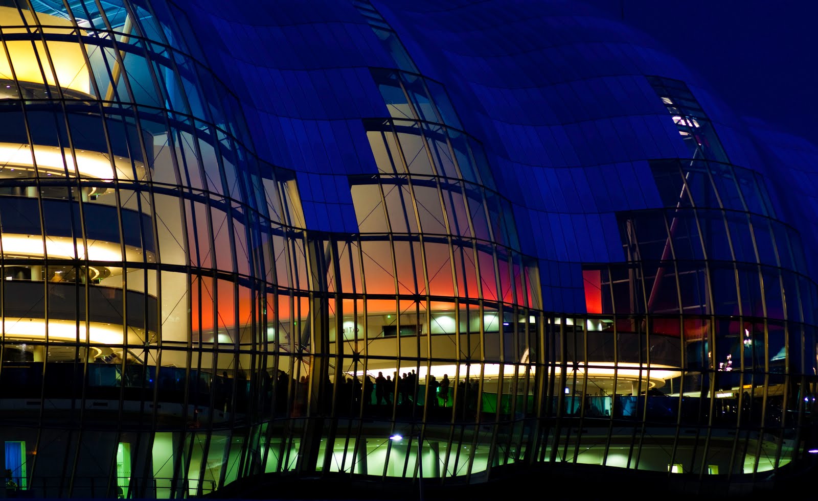
Finding orange & blue was a bit trickier. The richest source of orange that I could see at this time of year comes from streetlights. Therefore I attempted to create a blue & orange image using reflections of streetlights & sky. However the rain wasn't playing ball, so I couldn't find a puddle of sufficient size which would give me the required 1:2 proportions. However I was pleased with the final image, and it has given me inspiration for an image when we next get heavy rain and it is convenient to go out photographing.

The second part of the project required 3 -4 images of any strong colours that appeal. This was much easier as I felt less restricted in looking for a certain colour pair.


Project 34: Black & White & Grey as Colours


This project required me to photograph a white, black & grey scene (or more than 1) and observe the effect of exposure on the colours and tones. As with the other colour projects (but not assignment 2) I have not been very exciting with the choice of subject, as the core focus of the project is on the colours.

In my white scene with the milk bottle on a white background, there was clear evidence of colour as the scene got darker, with blue tones in the background and yellow hues on the cloth that the milk bottle was resting on. I have often noticed yellow hues when I have taken scenes with a white background; I tend to correct those in Photoshop. The milk bottle itself seemed to get grey as the exposure got darker rather than coloured. I also photographed some white laundry which required overexposure to get rid of the grey. The classic white scene, which I have a lot of in my portfolio from recent months, is a snowy scene. The old adage is to dial in +2 i.e. "overexpose" by 2 stops as opposed to the light meter correct reading. However it was interesting how a lot of my snow shots looked blue, although I also used did some post editing to warm up some images by introducing some golden tones. Snow shots with all the colour removed seemed to look overexposed as there was too much glare.

For the black scene, I have fewer such examples from my archive (although owning a pet with black fur would probably give me some examples!). As anticipated, most of my shots showed grey rather than black. I did not see much colour in my "blacks" although my background was non reflective card. In order to get the black to be black would have caused loss of detail in the lenses, which were more pure black than the background. Correctly exposing a black scene is a technical skill I would like to master.

I wasn't totally sure about the project requirements for a grey scene, particularly as many black scenes that I took ended up to be grey. I have uploaded some examples.

The notes do refer to colour bias of films, which is not really applicable to digital, although white balance management is relevant. My experience has generally been to trust the camera to set the correct white balance, and any mishaps are easily corrected in Lightroom. Sometimes I change the WB settings to alter the mood of an image. Other such tricks include setting WB to "Cloudy" to enhance Autumnal landscape colours. My key learning outcome from this project has been to understand the difficulties of correctly exposing for white & black scenes, whereby the colours are kept pure but the detail is not lost, either in the highlights or shadows, as well as gaining some experience of spotting colour is supposedly neutral scenes.