Saturday, 16 January 2010

Project 29: Applying the Elements of Design


This was a beast of a project, requiring at least 10 images of a similar subject to demonstrate all of the following effects:
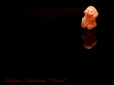
  • single point
  • 2 points
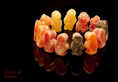
  • several points in a deliberate shape
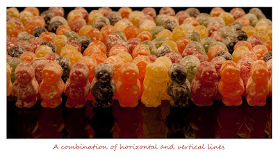
  • a combination of vertical and horizontal lines
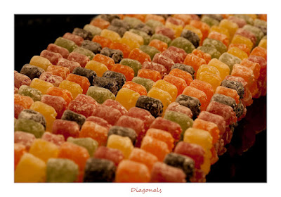
  • diagonals
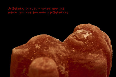
  • curves
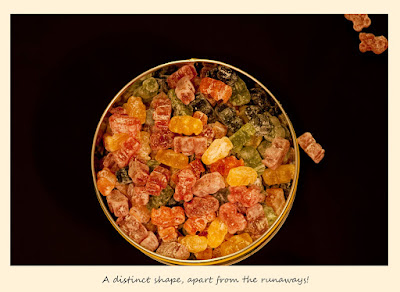
  • distinct shapes
  • at least 2 kinds of implied triangle
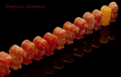
  • rhythm
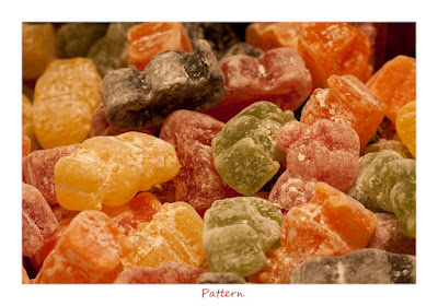
  • pattern
From the offered groups of subjects, I chose food as a subject, specifically jellybabies. I first took a jelly baby series when I did my Open University course on photography, and I have wanted to revisit it for some time. Although I dislike still life photography, jellybabies make good subjects because of their human form and bright colours, making for some fun and attractive colourful images. I photographed most of the sequence on my hob, using the remarkably effective oven light, and the hob was cleaned up in Photoshop! This gives added visual interest in the form of reflections.

So here goes - thoroughly sick of jellybabies after this sequence! My favourite of the set is the "Two Points". It tells a story, which can be one of humour or one of sadness & despair, it's down to the viewer to decide. This makes it the most interesting of the series, in my opinion. This was a surprise, as 2 point compositions are often unsatisfying (referring back to the notes). I guess this illustrates the point that the subject matter drives the design, and there are no hard and fast rules. The "curves" shot didn't really work, but I didn't want to simply set up a curved line as that seemed a bit contrived, especially in relation to the other images.

Project 28: Rhythms and Patterns


For this project, the requirement was to produce one picture conveying rhythm and one picture conveying pattern. I don't think any of the pictures I took are particularly inspiring however it has certainly given me plenty food for thought. I find that many patterns can also convey rhythm (to me anyway), but the notes state that the main difference between them is that rhythm is to do with movement across a picture i.e. there is a direction for the eye to follow. Due to circumstances, I chose to take some of these shots at work (where I currently spend my daylight hours) and this opened my eyes to how modern architecture provides quite a rich source of both rhythm and pattern. Thinking about it, architecture through most ages probably does, for example the streets of Bath and Victorian terraces that go on an on.

I also had the idea that birds perched on a wire, taken from a certain angle, could produce an image with rhythm. I will upload this when I have the opportunity to find such an image.

Project 27: Real & Implied Circles


As I still have a dislike of taking still life arrangements, I was pleased that I managed to achieve this project through natural situations. The full moon dominates the image by virtue of being the only subject against a black background, but also holds interest as I think we are naturally drawn to look and wonder at the moon. This is a real circle, and I also considered that the swan was a real circle, although it's slightly uneven outline may make it more of an implied circle. Cats curled up in a ball would be similar subjects.

The tunnel shot was a chance shoot through the front (very dirty) window of a Metro Train - I took several such shots but this one had the strongest implied circle.

Looking through "The Photograph", I did not find any real circles like those included in the notes (such as with the plate of food). I also found it difficult to find many examples of implied circles, other than perhaps certain full face portraits where the face was round. The most striking example of an implied circle was "Mes Voeux" by Annette Messager, which has been deliberately created. Another less obvious example is "Fruit" by Roger Fenton. It didn't strike me at first, but another look showed the bold outline of the grapes , pineapple and smaller fruits form an approximate circle.

It was interesting that the study notes state that circles are much less easy to find (than triangles) and were therefore less useful in photography, although when found they are the tightest, most compact and enclosing of any shape. I am doing all the "shape" projects concurrently, and yet I managed to complete the circles project first, despite them being more elusive.

Project 26: Real & Implied Triangles


What struck me when looking through "The Photograph" by Graham Clarke was how often triangles are used in design, particularly when the main subject is human. Contrast this with how few contained a single point (although they were much commoner in wildlife compositions). I especially liked the composition on p 135 (Untitled illustration from Picture Post 1950s, Anonymous). The triangle composition is also very strong in "Nude" by Edward Weston. I don't particularly like Nude photography, but I did flag this image up as an exception earlier in my blog. It is now clear to me that the composition, and the use of a triangle in design, is what drew it to me initially, along with the subtlety of the subject.

Of all the photos taken for this project, I was most disappointed with the first photo shown, whereby the convergence is downwards with the apex of the triangle at the bottom. The only way I could conceive to create this particular shot was by taking a photo from a height. However using a building as a subject meant finding the right viewpoint without compromising my own safety was quite difficult. I did manage to capture the convergence, however the effect is not as dynamic and strong as the other 2 shots whereby the convergence was upwards, created by a low and wide view. A taller building with a viewing platform would have been easier, but there are not many of those in the North East.

Project 25: Rectangles

I found this project much harder than the "lines" in terms of finding suitable situations and scenarios that also produced interesting images. Whilst I could find plenty rectangles, the resulting images were bland, I note that the 3 examples given in the notes all contain a human subject to add interest to the scene. I attempted to do this above with the shot from my living room. It contains lots of rectangles due to the fire and TV cabinet/ cupboards although it is not possible to include both of those in the image as rectangles because of the angle of the fire to the cupboard. This was taken with a point and shoot after dark, so it is noisy and unsharp, however I liked the concept of the image whereby it was repeated in the tv screen. I may try this again when the light is better (and the mess has been tidied up).

The church tower was difficult to capture in an exact rectangle, and the image did require some correction of the converging verticals.

Probably the most "interesting" image was a shot of a doorway of a disused pub on Newcastle Quayside, although this would mainly be of local interest. "The Cooperage" is one of the oldest buildings in Newcastle (only the Keep & Castle are older) and dates back to the 13th century. It was very rustic inside and was always very busy. Much regeneration has taken place around this area, including brand new flats, and sadly the pub was closed in 2009 after noise complaints from said flats, after 30 lifetimes. The pub was full of smashed glass inside, although the bar stools were still standing inside. I chose to photograph the door, aside from the rectangles, because of the Geordie humour chalked above on the door.


Project 24: Shapes


This project required 2 objects, photographed in a way that enhances their shape. I ended up with 3 images as follows:

1. An image of a strongly coloured, dark subject, silhouetted against a bright white background.
2. A transparent subject, only visible by virtue of its outline, backlit against a white background.
3. A high contrast scenario, whereby the subject is lit against a dark background. The latter was achieved by using a torch to light the subject in a darkened room.

Of the 3 images, I found the first one to be the weakest, probably by virtue of its rather bland shape and single colour. I liked the wine glass the best, although this is an image taken many times and a typical stock shot. The most interesting was the 3rd example, whereby the old rustic bottle was pictured in an interesting way by painting with torchlight. I then used colour to give the image more effect in a triptych.

I would like to try this out using more natural examples rather than set ups at home, using natural light as a contrast. In particular, I would like to take a wildlife shot using backlighting; this is something I have not yet achieved, but often delivers great drama.

Project 23: Implied Lines


I found the last part of this project the most challenging, namely the planning and taking of an image with implied lines. In particular, the eye-line was a challenge because it is difficult to control where a subject will look. This is particularly the case with small children and pets, who are my commonest subjects. In the past, I have typically snapped away over a period of time, and generally a couple of the crop will have strong eye lines as shown in the 2 "archive" images above. Given the season, and my current longer working hours, such photo opportunities are few and far between, so I decided to take this image where I knew my son would be concentrating.

For the line that points, I chose a local disused church. Despite it being unused, and having no lights, when I went inside there were 3 candles alight at the Alter. Coupled with the stained glass window above, the aisle of the church naturally leads the eye up to the alter and the light i.e. it points to the light. There are other areas of interest in the photo, but they hold much less attention. This was a long exposure of 30s, which unfortunately caused the stained glass windows to burn out.


Monday, 4 January 2010

Project 22: Curves


I found this the easiest "line" to construct in compositions. I liked the description in the notes of a curve having a sense of movement and direction, and also for evoking smoothness, grace & elegance.

I found a number of images from my "archives" which contained curves, as they had appealed to me by virtue of the curve in the composition. I have included one which shows how a curve was introduced into the composition by choosing the appropriate viewpoint on the bridge. I have similar shots taken from a steam train. Although dependent on the subject matter, I find curves the most attractive "line" in a composition, in that the curve itself can distinguish a shot where a vertical or horizontal line is not so inherently attractive in itself.
Since "finishing" this project I am finding more curves around me, including a lovely curved track in the snow whilst out walking the dog, hence there's more than the prerequisite 4 images!