Wednesday, 9 June 2010

Project 55: Light Intensity

I have a 1000w studio light which I used for this project. It is a constant tungsten light, and does indeed become very hot. I have had it for about 18 months, and don't use it very often, mainly because I don't really know how to!

Here's the full f-stop scale for reference: f1.4, f2, f2.8, f4, f5.6, f8, f11, f16, f22, f32. I also had a look back at my notes from T189 and each f-stop approximately doubles the area of the aperture. One stop is an effective doubling (or halving) of the area of the aperture, the shutter speed or the ISO equivalency. One stop represents half as much light. It is possible to derive the f-stop scale by taking the square root of 2 & multiplying it by itself. I've just tried this in Excel & it works, so handy to know if you forget the f-stop scale and happen to have a scientific calculator in your handbag!

The first problem that I had was using the suggested settings from the notes i.e. ISO 100 & a shutter speed of 1/30. The aperture readings for the bright midday sun & cloudy day were f27 & f6.7 respectively. The 1m reading was f11 and the 2m reading was f4 (which was also the widest aperture setting for the lens attached to the camera, so the actual aperture reading may have been below that). Therefore beyond 2m, it was impossible to take any more readings because the aperture had reached its widest value, and the reading at 2m was unreliable because my particular lens was not fast enought. This was a bit of a surprise, because the 1000W lamp seems so blindingly bright and yet is considerably weaker than outdoor light even a short distance directly in front. By 1m distance from the lamp it is 3 stops weaker than midday sun. Beyond 2m it is unusable at ISO 100 and the slowest shutter speed for handheld. 2 readings were clearly insufficient to draw a graph but it was a useful illustration.

So, determined to get my graph, I then changed the ISO setting to 800 (3 stops) in order to get more readings. I am unable to go out to 12 metres through because my house isn't big enough! I then converted the sunny & cloudy readings to approx f76 (using the handy square root of 2 method!) and f19 for comparison at ISO 800. This gave me readings out to 8 metres (the length of my house) which clearly demonstrated firstly the inverse square law (approximately); secondly the weakness of indoor lighting compared to natural light and thirdly that the light meter from the camera is difficult to use for this type of experiment (particularly when you are restricted by the minimum & maximum apertures of a lens)!


Whilst the results are demonstrated graphically, they can be summarised as follows:

When the distance from the light doubles, the strength of the light falls to one quarter the intensity. As one stop represents half as much light, then it follows that 2 stops represent a quarter as much light.

Therefore as the distance from the light doubles, the intensity of the light falls by 2 stops.

In practical terms, this would mean increasing the ISO from 100 to 400 say, or reducing the shutter speed from 1/100s to 1/25s.

I'm loving the maths, but what does this mean for photography in practical terms? Well, like a lot of things, it comes down to money. For still life photography, it means a tripod is essential to maintain image quality (and good tripods cost money!). For indoors portraiture, it means very powerful mains flash & associated bits & bobs to soften the light (big money). And for indoors sports photography it means very fast lenses and high spec cameras with a huge ISO range to enable fast shutter speeds to capture the action (Very very big money). It also means many digital compacts are not really suited for indoors photography because the high ISO makes many images unusable (see project 39) and they can't achieve the wide apertures required. Image stabilisation has helped to a degree, but there are still issues with image quality.

As always, an interesting project which helped to cement the science in my mind. I am enjoying the artificial light section of course, more so than the natural light section, for the simple reason that being able to control the lighting means you can do the projects at your own convenience. This is the great convenience of indoor lighting! Waiting for the right weather, and then having it coincide with being available to go out shooting, was quite frustrating given my restricted time due to small children & work.

Project 54: Outdoors at Night

With summer solstice in 6 days time, I have decided to postpone this project. I am hoping to complete the course in the summer, but if it takes me beyond August I will come back to this project. Although my previous assignment on colour, and earlier projects (Twilight & Rain) demonstrate that I have some experience of (and hopefully competence in) photographing my local city at night, there are some subjects that I would also like to try.

1. Our main shopping high street at night, ideally approaching Christmas time when there are lots of lights & lots of shoppers. I would like to capture motion blur of the shoppers against the sharp lights of the shops.

2. I would like to capture an industrial scene at night - this may require a trip further afield to Middlesborough, where there is a lot of heavy industry. Alternatively a trip to the North Shields ferry terminal may have some interesting scenes at night.

3. I would also like to capture a night shot using very high iso setting, giving a grainy effect, but obviously where the grain adds to the image rather than spoils it. Some of our old quayside buildings may suit that.

It's ironic that I spent winter complaining about the short days being bad for photography, and now I'm looking forward to the dark nights so I can go out trying some new shots! In the meantime, here is a shot showing my village at rush hour!


Update 9 October 2010 - Well as promised, here's some photos from a recent twilight trip to Newcastle Quayside. Incidentally, I missed the deadline for November assessment!


Project 53: Fluorescent Light

Had I done this project 10 years ago in the cottage I lived in then, I could have taken these images in the kitchen itself which had a horrible strip light across the ceiling. It did that awful flickering & buzzing before switching on and blinding you as you came in from the dark lane. Thankfully such lights are hardly seen in houses now, and the effect of light on mood is commented on in "Light Science & Magic" where it refers to the effect on mood (& productivity?) of office workers when you compare fluorescent lights to tungsten spots to overhead skylights.

My feeling with this exercise is that it was again more relevant in the days of film, as white balance settings generally correct these casts. Shooting in RAW gives an extra margin of error as white balance can be corrected post shutter if required. The other problem I had with this project was the fact that it required taking photos in locations that can be a bit awkward (why is that woman over there taking a picture of the fruit & veg isle in our supermarket - that sort of thing!).

Regarding film, I listened to an interesting podcast from Chris Marquardt who has recently started enjoying film as opposed to digital. He said that he was enjoying the slow pace with film, and the different mindset that brought. With digital, the workflow means that you can correct so much after the event, so he normally takes several images and then picks the best later. With film there is no such luxury, therefore much more time is spent pre shutter making sure that he gets it right first time. This means composition, exposure, colour balance etc. must all be right first time. I still have a film SLR that my husband used, but I have never used it. I would like the challenge of taking some film images for the reasons that he states, but for some reason it scares me. Perhaps at the end of the course, I may try a roll and see what comes.

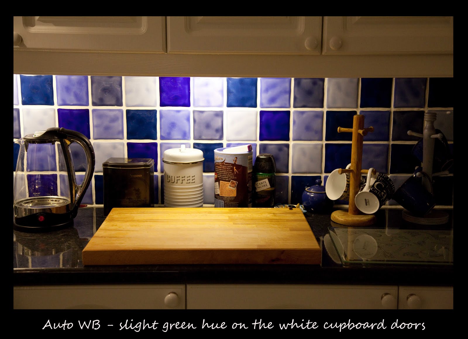
Anyway, I managed to find 3 locations which were not polluted by window light - my kitchen worktop at night, a consulting room at the vets and Tesco. The most "coloured" light seemed to be the one in the vets, which probably reflects the age of the light. The Tesco lights were very bright & uncoloured, and even the Daylight WB setting didn't create a strong cast. The auto WB setting did a pretty good job in all cases, although the fluorescent WB setting created the most colourless image in every case. I must admit I sometimes struggle to see colour casts, unless they are really obvious, so I tried to use white in the images so that the green colour could be seen most easily.

The key learning point from this project was to heighten awareness of the colours of artificial light, and to give consideration as to whether they add to the image or should be corrected. It also supports my current workflow of shooting in RAW which gives extra flexibility for toning down/ correcting casts when they occur.

I have included an example taken in the snow at the end of last year, where the light was entirely sourced from the streetlights. This produced an orange image which I tried to correct but couldn't as it simply took on another colour such as green or blue. In the end, I converted it to black & white, which gave quite a nice image because of the shadows.


Project 52: Tungsten Balance

Once again, I have great sympathy for those students who learned photography with film cameras, and indeed took this course in the era of film. The time lapse from shooting to seeing the prints, combined with the heavy expense & faffing around with different types of film & filters, must have made it so difficult to learn and I am often struck by this when doing these projects.

Anyway, back to the project in hand. Starting with the candlelight images, the key learning points were:

  • These were taken on "auto" white balance. Setting the white balance to "tungsten" neutralised some of the orange glow but not all of it. This confirms the point in the notes that candlelight is "redder" than tungsten.
  • The light is very weak. This required the subject to stand almost right over the candle for his face to be illuminated.
  • The most evocative pictures were those where the subject was right over the candle, and the shot exposed for his face. This caused the entire background to black out. Images which included the background just looked orange, and were unattractive.
  • Candlelight produces lovely "interesting" portraits, however it is difficult to focus on the subject because of the weak light, and care must be taken not to produce spooky eerie images because of the light. Its a delicate balance.
  • Close up candlelight gives good catch lights in the eyes. This makes the eyes look sharper, despite a very wide aperture being used.
  • High ISO settings, together with a wide aperture, are required to allow a suitable shutter speed for a human subject (especially a young one). I chose ISO 800 for the close ups and ISO 3200 for those where the background was included. All pictures were taken with my 50mm f1.8 lens wide open.
Regarding the photos taken with the tungsten lighting, the room was lit with a ceiling light of 100W and a small bedside lamp of 40W. Key learning outcomes were as follows:

  • Daylight balance with flash produced an image virtually colourless with a slight hint of a blue cast. This was because the flash (which is daylight balanced) overwhelmed the tungsten lighting, thereby removing the orange cast, but a slight blue cast arose due to the mixing of 2 different lighting sources. This is a common issue in indoor lighting.
  • Daylight balance without flash produced a very warm orange/yellow image. I didn't think this was particularly offensive, because the setting of the room was included in the image, so it had quite a cosy feel. A close up portrait would have looked a bit strange with this lighting.
  • Secondary light sources, such as a bedside lamp, end up overexposed, but this is not necessarily a negative in a picture. The radiating light from the bedside lamp creates an interesting effect, and also demonstrates how weak it is.
  • Tungsten balance at +1 EV gave the most colourless image. I think this is because the slightly higher exposure would cause any colour cast to be weaker (thinking back to earlier projects on colour where underexposure intensified the colours). The image at 0 EV is also acceptable I thought.
  • Using tungsten balance with flash produces a very blue image which is unusable. This is because the flash overwhelms the weaker tungsten lighting so the effect of the tungsten balance is to add a blue cast to neutralise an orange colour that isn't there. Once again, underexposing the image by 1 stop resulted in the colour from the cast being intensified.
Although this project seemed a little tedious at first, I feel like a light bulb has gone on (excuse the pun!) in my head in terms of understanding how white balance settings work. This was something I didn't totally grasp during my previous open university course on photography but it feels much more intuitive now. I think my results also demonstrate how the colour of lights can be used to create atmosphere (especially candlelight) but the effect must be used with care or it can spoil an image.


Project 51: Tungsten Lights

Well I have now moved on to the penultimate section of the course (I think!) which is artificial light. I plan to study this section of the course alongside reading "Light Science & Magic" which is a great book for improving understanding of the light & its behaviour. I still haven't had completed Assignment 3 although I have a number of ideas and just need to wait for some dramatic evening light. The current rain is excellent for getting started on "Artificial Light".

Project 51 was a simple exercise to appreciate the colour of tungsten lights. I expected it to be more orange than yellow, but I am thinking of photographs taken inside with lower quality cameras that often have an orange cast. When I did the exercise of looking outside and then inside, I found the brightness the most overwhelming difference, but yes I saw yellow too. Another illustration of the colour of tungsten lights is when I am out walking the dog in the evening - the windows in the houses stand out orange against the fading light.

The other key learning point was how hand held photography was virtually impossible using a ISO 100 setting. The widest aperture available was f4.5 on my particular lens, requiring shutter speeds between 1 second and 1/8th of the second across various parts of the room. Although completely obvious to me now, and something I take forgranted, but it is only a few years since this would not have been apparent to me. I fell into photography as a hobby as a result of a bad camera purchase. My first digital camera was a Fuji Finepix A303 (3.1 MP) and it captured some lovely memories of my eldest son when he was young. However it got broken, so I purchased a Samsung compact with 5.1 MP. I thought it would be an upgrade but sadly the first year of my youngest son life is recorded in a series of blurred photographs. Nearly all were taken inside with window light, and the camera didn't have image stabilisation, resulting in every picture being blurred as a result of slow shutter speeds. I didn't even know what aperture or shutter speed meant in those days. After I went back to work, I remedied the situation by purchasing a bridge camera (Fuji Finepix S9600). I then realised I didn't really know how to use it properly so I enrolled on the T189 Open University course on digital photography. Then I got the bug, and a very expensive bug it is too. And all because of slow shutter speeds required indoors.

So no pictures for this project just the following key learning points:

  • Orange
  • Too weak for handheld photography
  • Very uneven around the room

Wednesday, 19 May 2010

Mastering the light


I am conscious that my blog has slipped a little over the last 2 months. Part of this is a feeling of "hitting the wall" in terms of ideas & inspirations, and part of this reflects my current circumstances and lack of free time to go out & about with my camera and see what catches my eye. I also find it quite frustrating doing the outdoor projects, because it doesn't always go to plan. I have recently sold a lot of equipment on Ebay (previous kit & zoom lens) to raise funds for 2 new replacement lenses. One of those is a 135mm prime, which I am looking forward to going out and about with, as I believe a prime lens is the best way to become totally comfortable with focal length and its impact on your photography. I have also constructed 2 DIY lighting setups, using guidance from magazines/ online and thought I would post to share the result from one, even though they are off piste from the study notes.

The lighting effect for the rose was backlit, but falling off towards the edges resulting in a dark outline and fine art look. This was achieved by using a cereal box and filling the back panel with white card so that the rose was backlit, and putting black card around the rest of the box so that the shadows gave the dark outline. Some foil on the front of the camera reflected the light back onto the front of the rose, and a tripod was used for a sharp image with the slower shutter speed. I am pleased with the result, even though it is unoriginal and created by simply following instructions, but the project has definately increased my understanding of the light & its effects on a subject, which I hope to put to good use in the next part of the course on artificial light.

Tuesday, 30 March 2010

Project 50: Rain

I have had this project in mind for a few months, so when the opportunity presents itself I can fulfil the brief. Otherwise I could have found myself in the middle of a drought and unable to complete the project (here's hoping). Here are some of the fruits of my "rain" shots.

I was surprised at how rich the colours were in the "raindrops" shots, when often the atmosphere was grey & dull.