This project is essentially in 4 parts, designed to demonstrate how to achieve correct exposure by understanding how my camera meter works.
1. Read my camera manual & understand the specific metering modes that my camera has, and how they work;
2. Identify some famous photographs where the subjects are intrinsically very light or very dark;
3. Produce between 4 & 6 photographs which are deliberately lighter or darker than average; and
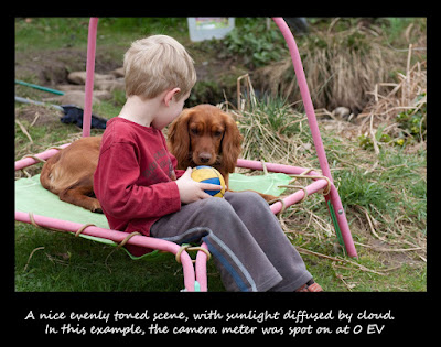
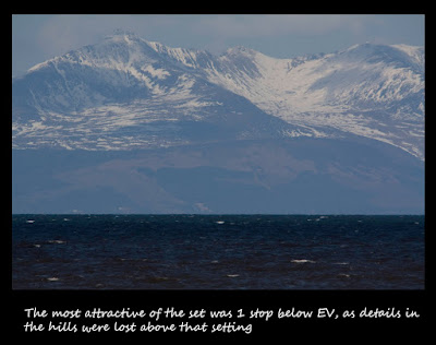
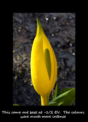
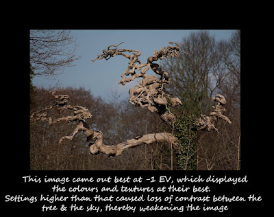
4. Take 5 bracketed exposures of any subject.
Part 1 My Camera
This is probably the first time I've looked at my manual since starting the course (see early entry in my blog) and it served as a timely reminder that I should refer back to it more often. My camera is a Canon EOS 450D which is described as an entry level DSLR (does that mean the photos it produces are of inferior quality or it lacks functionality that I am unlikely to ever use anyway?). It has 4 methods of metering, and I have only ever used Evaluative metering.
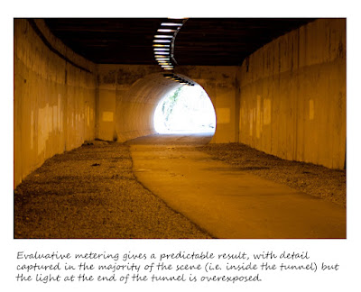
Evaluative metering is described as an all round metering mode suited for portraits & backlit subjects. Although my camera is permanently set to this, I have subconsiously been aware of its limitations and occasionally overide the "correct" exposure settings that are suggested in aperture priority mode (my "default" setting on my camera) by switching to manual mode. This is also referred to as "pattern" in the metadata, and I guess this uses the "Coca Cola" magic ingedient that Canon manufacturers think will give the best exposure readings in the majority of scenes & subjects.
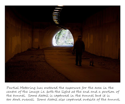
Partial metering is effective when the background is much brighter than the subject, and is weighted more heavily in the centre (or wherever the exposure is "locked"). I occassionally take portraits against the sky , and this would be a useful setting to adopt in that situation.
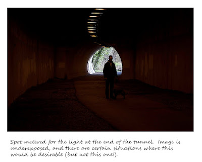
Spot metering is the most intuitive method, and meters for a specific part of the subject or scene. Apparently this is for advanced users only. Am I an advanced user? I can see certain situations when this might be used (illumination of a subject by a shaft of light for example).
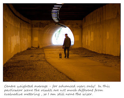
Centre weighted average metering is another method for advanced users only! The metering is weighted at the centre and then averaged for the entire scene. This is the one I have most trouble getting my head around, and I guess the only way to understand it is to use it.
To illustrate, I took some shots using the 4 different methods in a situation where there was high contrast, namely a light at the end of a tunnel. Unfortunately the centre weighted average results looked broadly similar to evaluative, so I find it hard to think where I may require this form of metering.
 Part 2 Picture Count
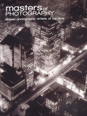
I chose to review "Masters of Photography" for such pictures. What was apparent to me was that there were far more intrinsically dark pictures than intrinsically light pictures. This is perhaps illustrative of how dark light is so much more evocative, certainly in black & white. I have also included the front cover of this book as one such high contrast example. This is an image by Berenice Abbott and I find it quite stunning. What caught me even more was that this picture was taken in 1932 - before WWII and before both my parents were born (they are now in their sixties)! When I think of the limited photographic equipment available then (no carbon fibre tripods, high ISO and instant feedback) it makes it all the more amazing. The skyline itself looks so "modern" and so electric.
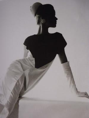
Another image that mesmerized me was by Horst P Horst "Evening Gown by Schiaparelli" - the lighting creating a silhouette of the model, coupled with the elegant angle of the model make this a timeless fashion shot. Despite the white gown & background, I think this image is intrinsically dark by virture of the lack of detail in the shadows.
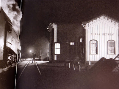
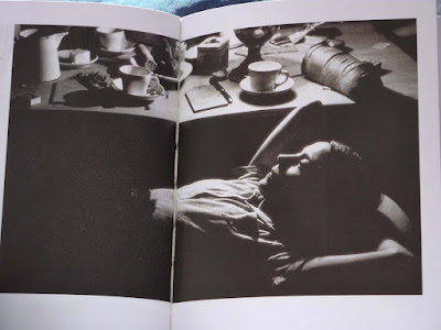
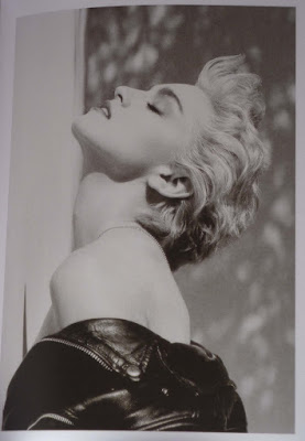
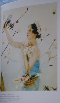
The other pictures shown as "dark" are Birmingham Special at Rural Retreat, Virginia by O. Winston Link (love his train shots) and an image by Willy Ronis of a resting circus performer. The "light" shots include the famous Madonna shot by Herb Ritts and Lady Ann Rhys as Flora by Madame Yevonde. The latter is another example of a shot that could be taken in the 1990s rather than in 1935. There were numerous other shots I would have liked to have included here, but Blogger being as it is (i.e. difficult to manipulate images on the page) I chose to be selective.
 Part 3: Produce 4 pictures that are either intrinsically dark or light
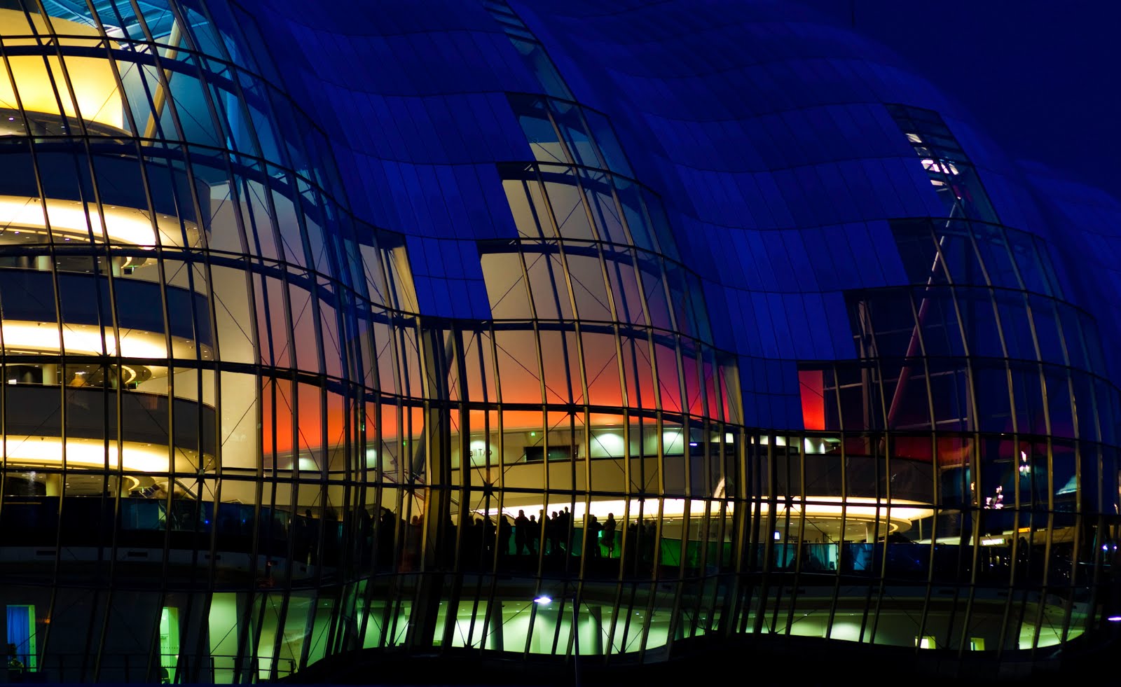
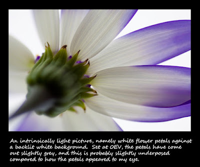
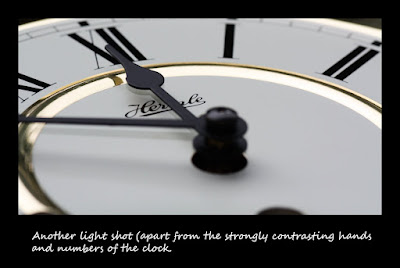
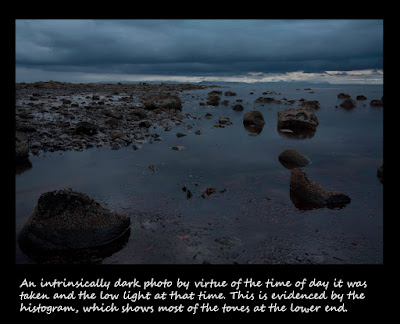
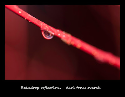
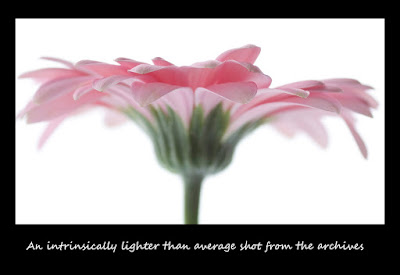
I admit to finding this part of the project a bit of a struggle as I am currently suffering from a drought of inspiration. I really enjoyed the Elements of Design part of the course, and the assignment on colour but am now suffering from the photographic equivalent of writers block. In terms of the intrinsically dark images, I firstly thought of black and of producing a black shot, similar to the earlier project on "black, white & grey as colours". Obvious subjects included a black cat, dog, camera equipment etc. However I found that the histogram for the Raindrops Reflections demonstrated how the tones were mostly in the shadows, making this my "darkest" shot. Similarly, the seascape was dark by virtue of being taken at dusk. So neither of my "dark" shots were black. I found the light shots really difficult to think of subjects other than flowers. I have included one from the archives which I liked at the time because of its lightness & delicateness. I think the clock face is also light overall, as the black numbers & hand make up a proportionately small part of the image.
Clearly a lot of my "snow" shots from the start of the year are intrinsically light.
 Part 4: Bracketed Exposures
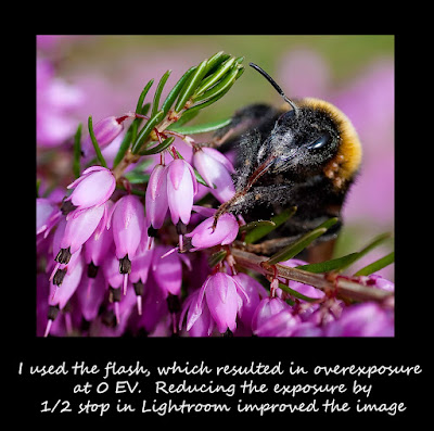
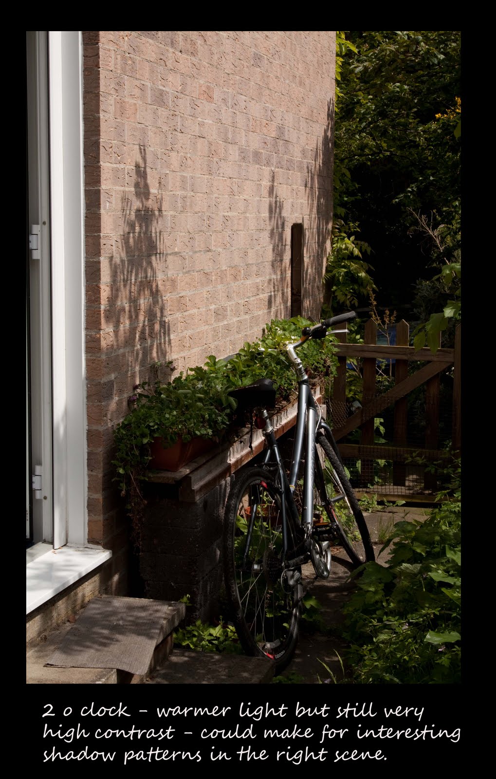
I always shoot in RAW which gives some leeway in "correcting" exposure post shutter, up to a point. Correcting underexposure does produce more noise in the image, whereas overexposure can be rescued more easily provided the highlights aren't blown completely. Mastering exposure pre shutter is something I would like to attain, as it would reduce post shutter work as well as leading to better images overall. I have bought the book "Perfect Exposure" by Michael Freeman, and plan to read this over the next few months. I also need to make more use of the different metering methods within my camera. My particular area of weakness is correctly exposing when flash has been used. As with everything, practice makes perfect, but this has been a useful exercise as some of the better images were those which had been underexposed compared to the meter reading. I haven't included all bracketed exposures here, but have included the "best" image from the set of bracketed exposures. I also included an example of an image corrected in Lightroom; bracketed exposures of insects aren't really practical. Interestingly, nearly all of my examples came out better when exposure was reduced. I am not sure whether this is a reflection of the particular subjects that I chose for this exercise. I don't need to correct the exposure on the majority of my shots (correction is the exception rather than the rule) so I was surprised at this particular result.