


I am quite pleased to have reached the stage of starting on the colour projects, as assignment 2 is on colour. It feels like a lot of ground is covered between assignments 1 & 2, without as much time as I would like to devote to these key areas.
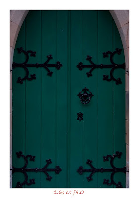
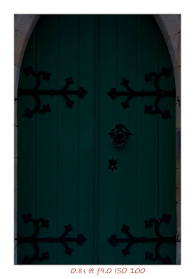
The aim of this project was to produce 5 photos over a range of exposures to assess the impact on colour. As usual I was racing against time to complete this before it got dark, as I was on my way home from work, hence the long exposures. I photographed a green church door near home, and it was immediately apparent that the impact of exposure on colour was to darken or lighten it. By lighten, I mean bleaching or washing out, which I think is distinct from brightness. Having read various discussions on forums about projects 30 & 31, it would appear that there is quite a lot of confusion over terms used when describing and classifying colours, and some are used interchangeably when in fact they are distinct - bright vs light. However what is critical to me is my perception of colour and the qualities of it. So for me, the words that come to my mind is that underexposure makes colour richer in depth whereas overexposure makes the colour paler, bleached and washed out. I can think of other examples where I notice this effect. On a sunny day, the sky appears white to my naked eye. When I put sunglasses on (akin to reducing exposure by an ND grad) it makes the sky appear rich blue. A similar effect is seen when using gradient filters either on camera or in image editing. Another example was on viewing my father in law's holiday snaps, most of which were taken in the middle of the day in bright sunlight. They were lacking in colour, as the colours were washed out by overexposure as a result of high contrast.
Another learning point from this project was the "info" window in Photoshop. I've never used this before but I was able to line up the series and look at the readings. Using RGB, the green reading increased as the exposure increased. This wasn't what I was initially expecting intuitively, as I thought the bleaching of the colour would reduce the reading. However what the RGB reading is actually telling me is the luminosity of the colour, so obviously the reading will increase as the exposure increases. What was of more interest was that the K reading on the CYMK scale decreased from 70% at the darkest exposure to 0% by the 10s exposure. K stands for the key plate (a printing term), which generally equates to the amount of black ink. Therefore darker colours have more black in them, and this effect on colour can also be seen in RAW by moving the black slider. For the lightest images, where the K reading was 0%, moving the black slider has little effect on the colour, although it makes it appear even brighter because the other areas of the image become darker. As soon as there is a K reading, then playing with the black slider can reduce the colour in the door to pure black.
I believe that the course notes are currently undergoing a rewrite to reflect the move to digital, and I must admit that I do find the regular references to film very confusing and distracting as I have never used a film SLR before. This hasn't been an issue with previous elements of the course which were more concerned with what the arrangement of what's in the viewfinder. Another area of confusion is due to "misprints" in project 31, whereby the project starts with the statement "The brightness of a colour can change and how you set the level of exposure determines this". The notes then go onto state that only hue can be altered at the time of shooting, and specifically states that you cannot alter brightness of colour as you shoot. Clearly contradictory, however my understanding is that the initial statement should have read "The lightness of a colour can change, depending on exposure settings". Therefore I could make a bright colour (say bright pink) lighter, by changing exposure settings, but I could not make a bright pink even brighter until I go into photoediting. This is something I hope I will get a greater grasp of when I move onto the next projects to create a slide library of colours.
No comments:
Post a Comment