Tuesday 30 March 2010

Project 50: Rain

I have had this project in mind for a few months, so when the opportunity presents itself I can fulfil the brief. Otherwise I could have found myself in the middle of a drought and unable to complete the project (here's hoping). Here are some of the fruits of my "rain" shots.

I was surprised at how rich the colours were in the "raindrops" shots, when often the atmosphere was grey & dull.


Project 49: Graduated Filters

This project was to utilise a graduated filter, both inside & outside. I purchased a graduated filter nearly 18 months ago, but it has barely been used. I also have an ND filter and a polariser. I have occasionally used the filters but I find them a bit of a fiddle, and I was also disappointed with the results from using a graduated filter. I now know this because I set the aperture at f11, resulting in a hard edge which didn't sit right in the scene.

However, using digital graduated filters in Lightroom, well that's another matter. I use this frequently when reviewing my images and doing processing tweaks. The Lightroom grad is particularly useful because you can have any angle and degree of impact. And this brings me onto a burning question. Assuming that you shoot in RAW (which I always do) and you have a tool such as Lightroom where the workflow for tweaking the RAW files is slick, is it better to use a graduated filter pre shutter or post shutter? I should also add that I convert my raw files to a DNG file when importing. I do this because the adjustments are applied directly to the RAW files, and also because it is a universally recognised format so I have less worry about my catalogue becoming obsolete or incompatible with future software. So here is my thoughts on that burning question.

1. Firstly, one of the arguments for doing things post shutter is that it saves you processing time afterwards. However, Lightroom means that applying a graduated filter is a split second job, so provided you are not taking a batch of say 50 photos then it is actually quicker than fiddling around in the backpack for the filter ring and screwing it onto the lens, then finding the filter, getting it in the right position etc. etc.

2. Secondly, I have commented in another blog post that I have recently acquired a high quality Canon L Lens, which one assumes is made of high quality glass. However my graduated filter is made of resin (Cokin P series) and therefore one assumes of an inferior quality to the glass in my lens. Will this affect image quality given that I am in hot pursuit of sharpness? Well maybe.

Therefore my conclusion is that I will probably use Lightroom rather than my physical filter, unless I find myself on a photoshoot of more than 50 landscapes which require a grad. The other time may be when the contrast is so great that the detail would be lost forever in the sky without a grad (using the term "Blinkies" to reflect the bane of digital photography where detail in pixels is lost forever when overexposed unlike in film where a greater dynamic range could be captured). However, a polariser is different in that it produces effects that can't be achieved post processing, and I do find that I use it far more often in the field that my grads.

Answers on a postcard if anyone has any advice on this burning question.

So back to the project brief. This required a shot of a landscape with & without a grad, and then a similar effect inside using the grad on its side. The latter was a bit of a revelation to me, as I would never have thought of using a grad in this way, although I may have resorted to it in Lightroom as an instinctive correction. In this particular case, my 2 stop grad was a bit too extreme for the interior shot as illustrated in the comments.


Project 48: Cloudy & Dull Weather

Note that blogger seems to have a mind of its own when it comes to sorting photos within text. Please don't give up and keep scrolling down until you get to the bottom!

I found this an interesting topic, as it is the source of much debate with my father in law. Although a very keen photographer, and 35mm SLR owner, he has not been able to embrace modern IT technology and is therefore now limited to a digital point & shoot. His view is that it is not worth getting the camera out if it is cloudy, and all subjects should be in the sun (including unwilling portrait subjects). At 77, it is unlikely that he will change his views. However he has a point with certain subjects, and his view has perhaps formed as a consequence of his photography style, and is perhaps a throwback to the heavy expense of film whereby you can't afford to waste a shot. He likes to photograph boats and flowers, as well as capturing the memory of a sunny day out. Given that flowers often require macro photography, a bright light is needed to enable hand held photography. Boats (and seascapes in general) look much more attractive in the sun, as the sea tends to look grey if it's overcast. And sunshine, and the shadows it casts, often add to the fond recollection of a day out - wasn't the weather so much sunnier back then! Even though unflattering to the people in the pictures (eyes squinting in the sun etc), it is the memory of the warmth of that day that is the raison d'etre for the photograph. The squinting eyes of the children in the 60s portray the heat of the day.

A slight diversion there, but it perhaps illustrates that to form hard & fast opinions of how things should be done (always have the sunlight on your subject etc.) can lead to missed opportunities in photography. An open mind, and a willingness of break the rules, can sometimes result in a gem for the collection. The great gift of the digital age is the low cost of experimentation.

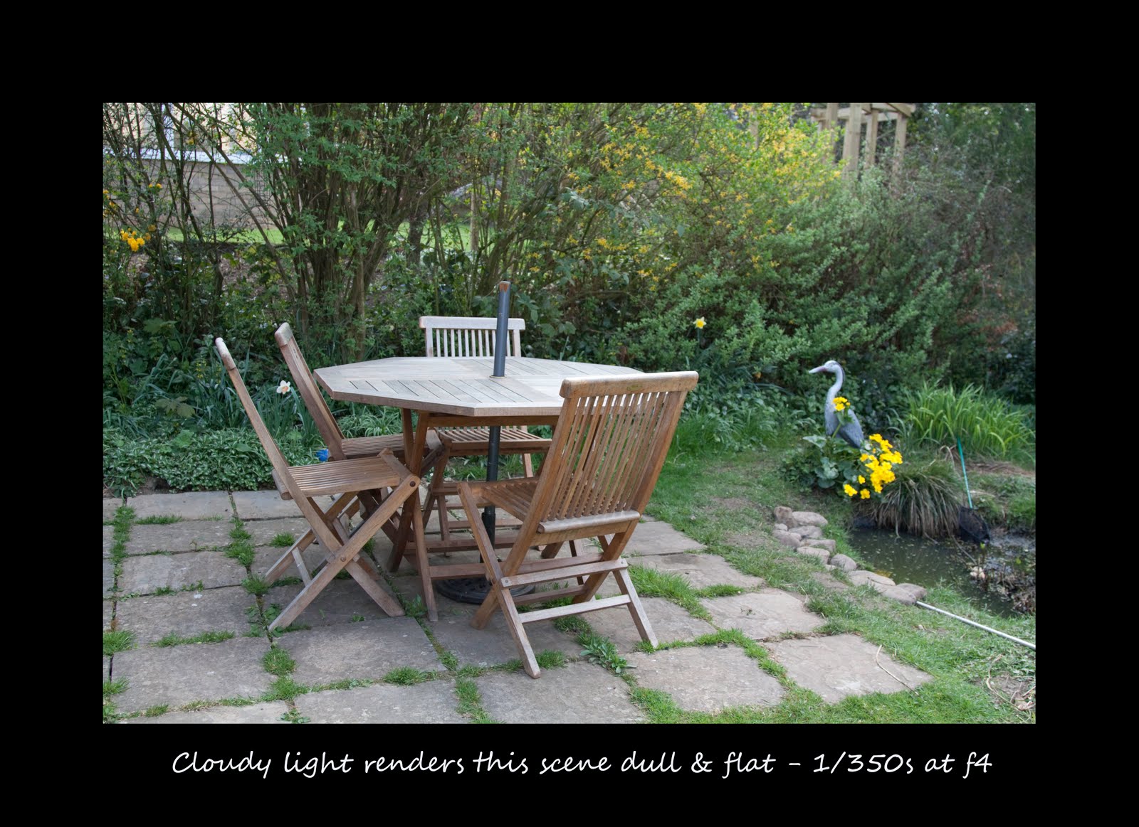
An example of such a rule to be broken is the slight snobbery that exists against taking pictures in the midday sun. Only amateurs do that don't they! However I have included one or two shots, where the shadows cast by the hard light actually make the picture worthwhile. For example, the shadows of the leaves on the bough, or the patterns created on the garden furniture. Patterns of light through treetops are examples of where bright sunlight can add an element of interest to an otherwise bland shot. The other consideration is the scene itself, whereby the effect of sunlight is essential to make the scene appeal. What I am driving at is the fact that a British seaside town can look dull & grey on an overcast day, but transforms in the sunshine. The same applies to a photograph. If the subject is of something related to warm weather (picnic tables, people dining al fresco, park games, gardens etc), it needs evidence of sunlight to complete the message of the image. Otherwise it would only be half way there.

Back to the tasks in hand. Firstly I photographed 4 scenes in sunlight & in cloud. The portrait & tulip were much more attractive images in cloudy light, but the playhouse & garden furniture were much more appealing in sunlight (partly to do with the rationale in the paragraph above). Although some flowers look better in sunlight, the texture of the tulip (and strong colour) are better represented in cloudy light. The general consensus is that cloudy light is more flattering for people, however I have also included a portrait of my younger son taken in bright sunlight. With a young subject (who has smooth peachy skin), a bit of post processing to give the shot a soft focus look shows that sometimes a portrait taken in bright sunlight can be effective, as the shadows across his face are not unflattering (in my opinion anyway!). The shadows added interest to a snapshot of a child. Generally the cloudy shots were 2 stops darker than the sunny ones, but this did not always work as a hard & fast rule. The auto white balance setting on the camera seemed to correct the colours on all my shots, although I must admit to having a bit of "blindness" to colour casts unless they are extreme.


For the cloudy shot from my archive, I chose one of Ayr High Street. I felt compelled to take a series of shots with my point & shoot because I was gobsmacked at the deterioration of the place. There were boarded up shops more often than not, and the streets were littered with to let signs and windows covered in windolene. Sometimes the name of the former occupier remained, as a reminder of who they were before they went bust. Anyway, the cloudy light makes the place look even more depressing, whereas sunlight would have made it more cheerful and therefore at odds with the meaning behind the image.


The 3 shots taken in cloudy light are best represented in that way, as reduced contrast enables capture of the highlights & lowlights, and colours are not washed out. The softness of my dogs fur is also best captured in that light, as she can look quite "wiry coated" in direct sunlight (not to mention half in shadow).


The final part of the project required a critical assessment of the light used in other images, to identify those taken in cloudy light. The Textbook is "The Photograph" by Graham Clarke, and I have previously commented that I find a number of the images within the book (especially nudes) quite unpleasant. However I focused on the chapter "The Landscape in Photography" as these were outside shots. As they are nearly all in black & white, and some dating from 100 years ago, a lot of the images in that chapter had quite a drab feel to them anyway, implying cloudy light but not necessarily so. I looked specifically for a lack of shadow as evidence of cloudy light. I also looked elsewhere in the book for a portrait image clearly taken outside in cloudy light. I identified the following images:

1. Angecroft Power Station, Pendlebury, Salford, Greater Manchester 1983 by John Davies. This includes a washed out completely cloudy sky and is a particularly effective photo because of the football game going on in the field next to the power station. This photo clearly does not follow the rural idyll of earlier landscape photographers such as Roger Fenton.

2. Inscription Rock New Mexico 1873 by Timothy O'Sullivan. Not strictly a landscape (although included within that chapter), but most definately captured in cloud or shade because of the textures evidence in the rock & the inscription.

3. Migrant Mother by Dorothea Lange - a photo that is etched in my mind, and clearly a portrait in cloudy light as there are no harsh shadows in this image.

Project 47: Twilight


Twilight is now falling later in the day (and sunrise before 6 am) however a look at my previous assignments and projects (see project 46) will show that this is the time I am most comfortable taking pictures. I love the deep blues (and other colours) that can be attained at this time, the atmospheric effects and have been in the fortunate position of looking both west & east at Sunset. I have also experienced the frustration of carrying my camera rucksack (and very heavy tripod) along the beach at twilight only to come back empty handed due to a poor show.

So given my current commitments & the timing of twilight at the moment, I decided to take the opportunity to look back through my archive of twilight shots and show a selection of my favourites. I haven't included here the one from the front page of my blog of the Tyne Bridge, which is another of my favourites.

Project 46: Choosing the Moment

I chose to do this project over 3 nights, and didn't plan an exact subject but went down to the beach at Doonfoot near Ayr. I have photographed a number of sunsets at this location and I included one such image in my second assignment. I had no clear subject in mind, other than to capture the fading light and "choose the moment". Although this was a slight crossover with project 47 - Twilight, I wanted to capture a number of images in the hour before sunset, using the light as a key mood ingredient. I felt this was close to the brief, and also a learning exercise for me. On each night, the light took on a different colour, and the grand finale on the 3rd night was a bright red sunset behind Arran. The richest photo of the sunset was moments before it went down. I also liked the one earlier on, where there was still a heat haze, as this added to the warmth of the image. As with the project on low sun, one needs to move fast as the sun starts to get below the horizon, as it changes by the minute.

What was also interesting was the patterns in the reflections in the water, and I positioned myself to capture those. On the last night, the orange sunset was reflected in the windows of the houses facing the beach - they looked as though they were on fire. Although a much less dramatic image, I felt it had interest because of the burning houses effect. I also attempted a panning shot of the birds and an abstract panning shot of the scene. None of the images in this project were taken with a tripod, as they were all exposed for the sky reducing the rest of the scene to a silhouette.

The key learning point from this project was to keep an open mind, and I ended up with images that I did not plan for. In particular, I liked the image of my son jumping in the water - it reminded me of a cross between a Lowry (for the stick figures) and Henri Cartier Bresson (the Decisive Moment). I also loved the one of the 2 dogs in the water; one is mine and I don't know where the big guy came from but he just trotted along and lay in the sea at just the right moment. I couldn't have planned for it better! Another shot of my son produced a trick of the light - the exposure conditions were so tricky that the camera produced an ethereal image where his silhouette appears to be radiating light. This was not planned, and the effect came out by accident, but it appeals to me for "interestingness" as they say on flickr.

I enjoyed this project very much and it has re-established some of the momentum for my photography which has taken a bit of a nose dive in the last 2 months. I was also pleased with the variety of the shots that I managed to achieve; part of this was down to luck but I also think going with a open mind and no clear plan helped.

Anyway, here are the fruits of my labours.


Project 45: Picture Count


The brief of this project was to review the Textbook (i.e. The Photograph by Graham Clarke) and another source for photographs in which each of the 4 lighting directions in the previous project were evident. I found The Photograph a difficult book for this project, possibly because so many were black & white and many of the images did not seem to make use of lighting as a key ingredient. This contrasted strongly with "Light on the Earth" which shows 2 decades of winning images from Wildlife Photographer of the Year. Many of those images used lighting to give their images sheer drama and impact, thereby distinguishing their images from purely illustrative ones that you may find in a wildlife encyclopaedia. What is particularly inspiring about a lot of those images is the dedication to catching the shot, including spending several winters in pursuit of an image, wading in freezing water etc. The most dramatic lighting was backlighting & rim lighting, and this is also the most difficult to expose. I have included 4 images from that book above, which demonstrate the drama of lighting effectively. The Bear Silhouette was taken by Rajesh Bedi from India in 1986, Bear Ecstasy was taken by Eero Kemila of Finland in 1997, the Badger was taken by Jason Venus of the UK in 1996 and the Leaping Langurs was taken by Anup Shah of the UK in 1997.

From "The Photograph" I identified "Baiting the Line" by David Hill & Robert Adamson, which showed the high contrast of side lighting very effectively. I also identified a fabulous picture by Paul Strand entitled "Wall Street, New York, 1915". The side lighting and long shadows from the low sun make this a genius image - a perfect moment. Aside from the light, I was also struck by the fact that all the men are dressed the same, which adds to the visual pattern of the image created by the long shadows. Finally, I included "Kansas City" by Harry Callahan, which used front lighting very effectively to create a rich red colour and strong vertical lines from the shadows.